Venice - The Old and The New

image
The Old

I just had to share a few examples of the contemporary Architecture in the amazing city of Venice....the city where everyone goes to feast their eyes on antiquity. My visit to Venice was part of a course of study on "Contemporary Italian Architecture". On this visit I had a chance to see a slightly different view of Venice.

The New:

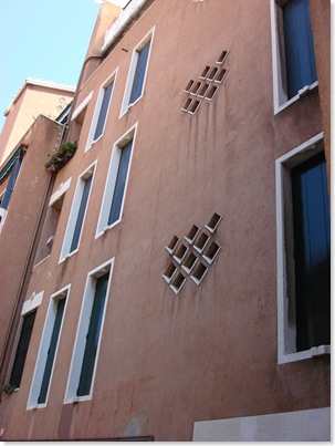
"Casa delle Zattere"

The building below "Casa delle Zattere" was designed in 1953 by architect Ignazio Gardella. Building a new structure in Venice has always presented a stylistic dilemma; how could one ever hope to design a modern building that was compatible with the prevailing styles.

Venice Day 1 156 Venice Day 1 159 Venice Day 1 157

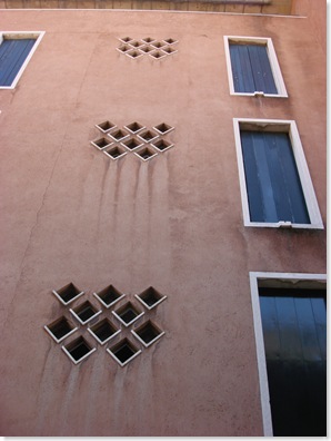
Details of windows of the "Casa delle Zattere"

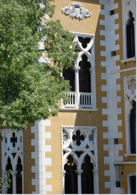
This design might be thought of as a new gothic palace, a modern building rendered with a veneer of subtle gothicising detail. The stone base, the window frames and sills, balustrades, chimneys, doorways and corners are all designed to make reference to 13th century details and ideas. Along the canal, the 6 story high fa�ade is detailed to fit comfortably with buildings to either side. The traditional Palace elements of base, piano nobile, attic, and roof are expressed within the context of a typical medieval Venetian courtyard house. The Architect, Gardella also used traditional Venetian building materials to help this building blend seamlessly into its surroundings. Today the home is occupied by the Cipriani family of the famed Cipriani Hotel.

Image of Zattere ...

Casa delle Zattere as seen from across the canal

Venice Day 1 164

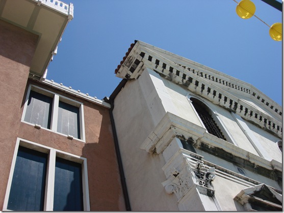
This is a detail of the Casa delle Zattere and the adjoining Medieval church. Notice how the cornice details were carried through from the church to the new building, helping the contemporary structure to seamlessly blend to the ancient structure.

Olivetti Showroom

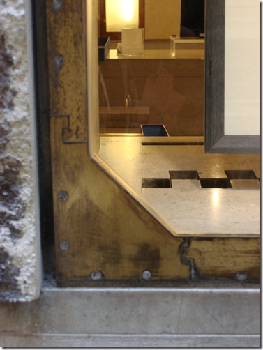
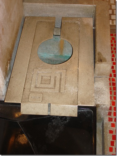
Below are details of the Olivetti Company showroom store designed by Carlo Scarpa 1957-1958 located in San Marco Plaza 101 . Carlo Scarpa paid great attention to detail, often using several different materials simultaneously. He explored tiny universes, studying the relationships among all the elements involved without losing sight of the project as a whole. This store is a virtual feast for the eyes. I could have spent several more hours there discovering all the details. Unfortunately I wasn't allowed to take pictures, but just happened to snap these from the outside. The store has been sold and is now occupied by an Art Gallery. It is a shame because they haven't done much to preserve the integrity of the original design. But it was still very worthwhile to visit and I found it very inspiring. Olivetti was very good in sponsoring and fostering the arts and were ahead of their time in being innovative.

Venice Day 1 186 Venice Day 1 183

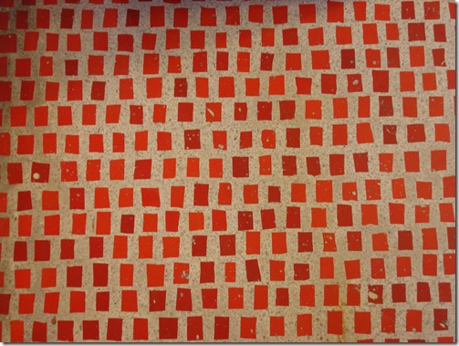
Close-up of the hand laid mosaic floor made of Murrine. Murrine are sliced pieces of candle-layered Murano-glass
used to make the internal ornamentation of millefiori glass-paperweights."

Venice Day 1 182 Venice Day 1 185

Left Window detail in brass Brass / Right Fountain detail

Querini Stampalia Garden

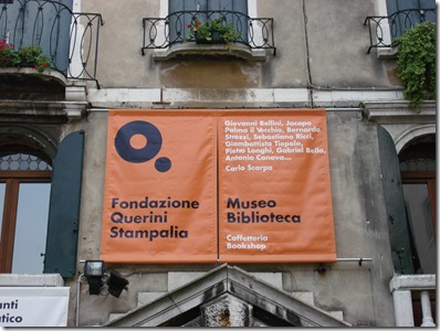
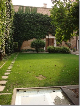
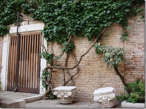
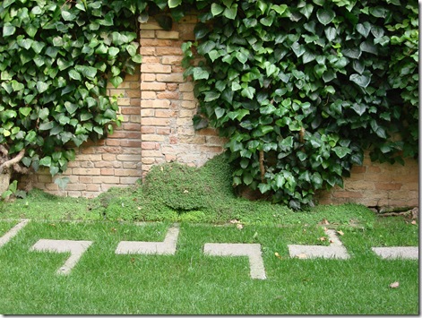
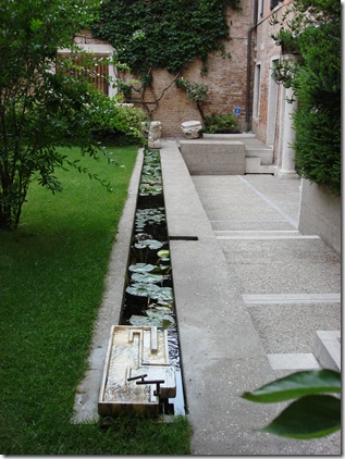
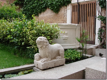
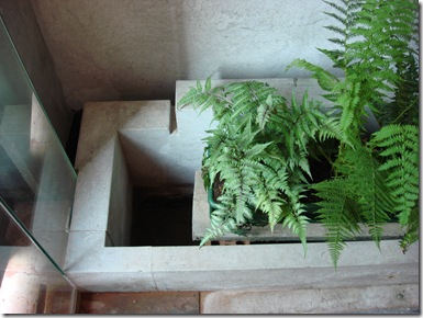
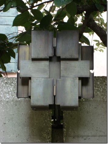
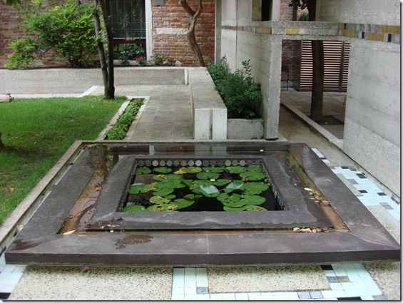
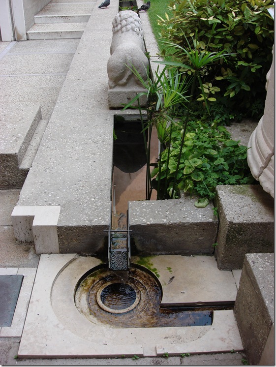
Carlo Scarpa (1906-1978) is an architect whose development draws on deep roots in the Veneto region, and on traditional forms and construction methods. He is the same architect that designed the Olivetti Showroom above. Galleria Querini Stampalia, (1961-1963) is the restoration of the ground-floor of an old Venetian palace with the integration of a garden that is used as a gallery and exhibition space. Again, as in the Olivetti showroom, the attention to detail was outstanding. I was fortunate to visit the garden late on a Sunday afternoon and was the only person there. I had the advantage of being able to view the garden in its entirety unobstructed, and plenty of time to savour the details.
Venice Day 2 072

Venice Day 2 151
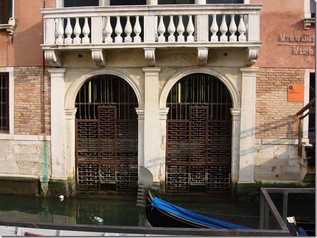
The building was a former Palace and this is the entry via Gondola. Scarpa designed the new metal doors.

Venice Day 2 084 Venice Day 2 098

Venice Day 2 088 Venice Day 2 078

Venice Day 2 103Venice Day 2 100

Venice Day 2 123 Venice Day 2 107

Venice Day 2 085

Venice Day 2 096

Hotel Monaco Renovation

I was very excited to see the new renovation of the Hotel Monaco as there has been some controversy surrounding it. One part of the Hotel remains intact in the traditional decor and the other part, being the entry off the side walkway and the Reception, have a new very glamorous modern look. I found the juxtaposition of the old with the new to be very fresh and well done.

image image

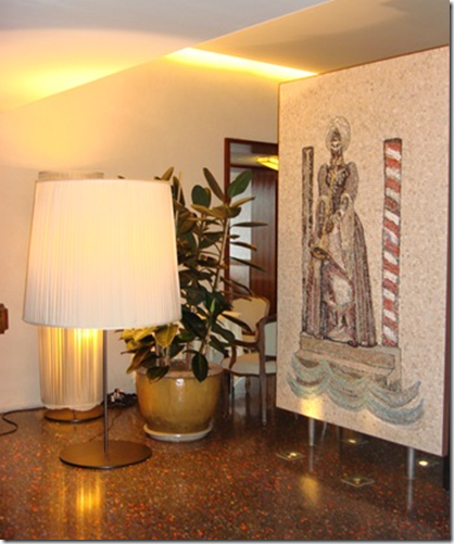
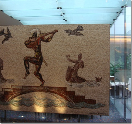
New mosaic panel and large scale lamps. Notice the beautiful terrazzo floors throughout.

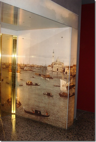
image image

Left is a large scale new mosaic panel that serves to separate the new covered interior courtyard from the Reception.
Right The elevator vestibule was a old Venetian canal scene reproduced on glass and backlit.

Venice Day 2 163 Venice Day 2 168

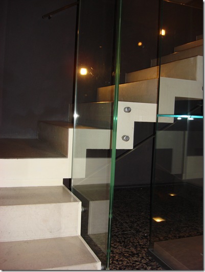
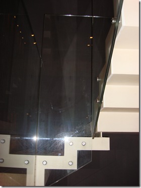
Stair details

Venice Day 2 171 Venice Day 2 170
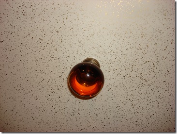
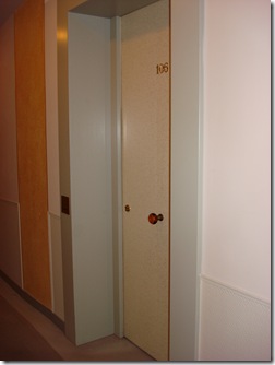
Suite entry doors. The bronze glass door knob was mounted in the center of the door....very cool.

Venice Day 2 181 Venice Day 2 178

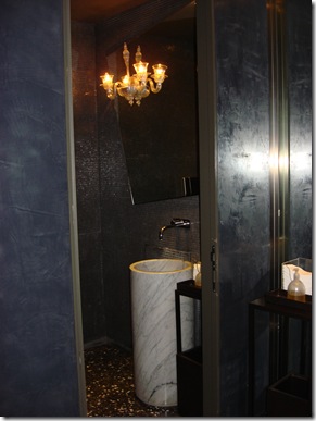
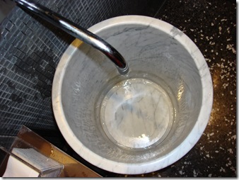
Public washrooms featured these Cararra marble sinks. The taps were motion activated. The Italians do bathrooms like no other country. They are employ more energy efficient techniques than are currently found in North America. For example most taps, even in homes are motion sensor operated. Toilets are dual flush- a small flush or a full flush. Lights are motion sensor operated, they turn on when someone enters the room and turn off when you leave. Paper products in bathrooms are kept to a minimum ( no toilet seat covers and no paper towels).

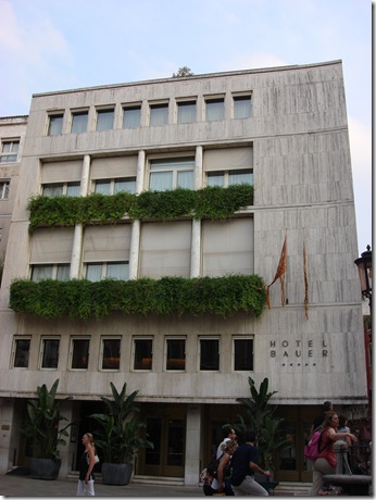
Hotel Bauer

Venice Day 2 197 Venice Day 2 211

Left The hotel from the street
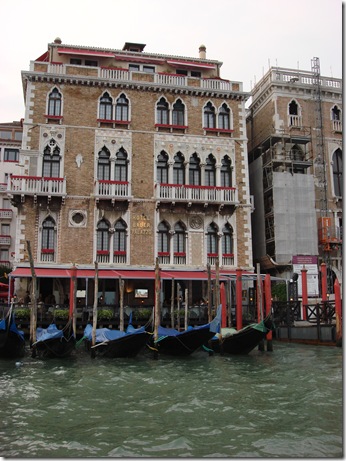
Right The Hotel from the Canal
Venice Day 2 202
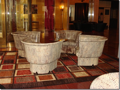
Lobby Chairs covered in Reptile Leather
Venice Day 2 205 Venice Day 2 204
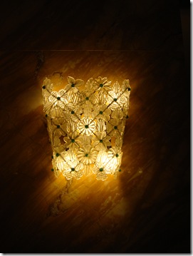
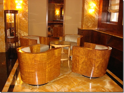
Right Murano glass ceiling & wall sconces

Venice Day 2 207 Venice Day 2 208

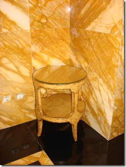
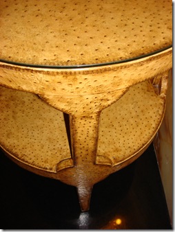
Table covered in Ostrich skin

Window Shopping

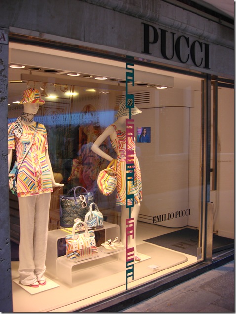
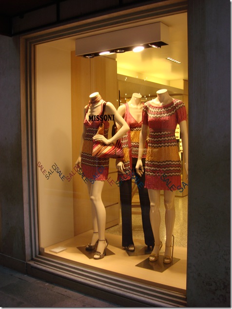
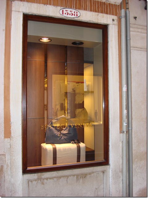
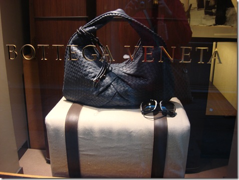
Emilio Pucci, Missoini, Bottega Veneta, Hermes - they are all there.......

Venice Day 2 188

You can�t mistake a Pucci print, which is iconically Italian. Since the late-1940s, when Italian skier and socialite Marchese Emilio Pucci casually tried his hand at design, the brand has been synonymous with bold, brightly colored graphic patterns with a kaleidoscopic, slightly psychedelic feel. Pucci prints usually appear on clingy, stretchy fabrics, and are widely applied in every category�evening wear, ready-to-wear, swimwear, accessories, shoes and home d�cor; they have even been featured in the logo of the Apollo 15 space mission and the interior of a Ford Lincoln Continental. Vintage Pucci is highly collectible, but present designer Christian LaCroix�s more current designs�which use prints from the Pucci archive�are also in high-demand.

Venice Day 2 190

Missoni is an Italian fashion house based in Milan. It is famous for its unique knitwear, made from a variety of fabrics in colourful patterns.

Venice Day 2 191

Bottega Veneta is a manufacturer of luxury leather goods, most famous for its Intrecciato line of woven leather. The company is based in the Veneto region of northeast Italy. A family firm founded in 1966, Bottega Veneta was bought by Gucci in 2001.
Venice Day 2 192

image
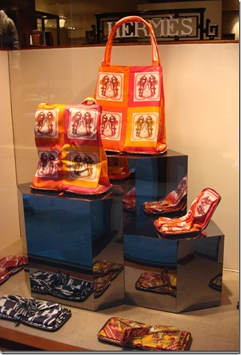
Hermes was showing it's hot, new scarf traveling bag. Bellissimo!!

See other articles on Venice:

The Island of Giudecca

VENICE - Bauer Palladio Hotel & Spa, Giudecca Island, Redentore

Venice - Architecture of the 20th Century

Patricia Gray writes about Interior Design inspirations, emerging trends, and the world of Design.
While you're here, subscribe to this feed so you don't miss out.
Related Posts:

Carlo Mollino Casa Mollino

Well I have just returned home from a marvelous, fantastic month in Italy and I was going through a pile of unread magazines and to my surprise I came across an article in Australia Vogue Living March/April 2008 issue on Casa Mollino, which I had just done a posting on yesterday (isn't it funny how that works), and which museum I was fortunate enough to visit when I was in Italy. I wasn't able to take my own pictures of the inside of this fantastic museum and monument of Carlo Mollino's designs, so I will indulge you with some shots from Australian Vogue Living, which is in my estimation one of the best Interior Design magazines!!!

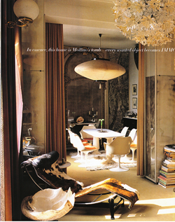
This house of Mollino's was decorated by him over 8 years. It was his playground and mausoleum and he never slept or entertained in it.

Carlo Mollino Casa Mollino www.patriciagrayinc.blogspot.com

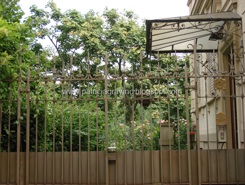
This is the entry off the street to Casa Mollino. You can get a glimpse of the rose garden and beyond the rose garden is the River Po.

Carlo Mollino Casa Mollino www.patriciagrayinc.blogspot.com

Casa Mollino occupies the first floor (which in North America would be referred to as the second floor) of this beautiful historic building.

Carlo Mollino Casa Mollino Australian Vogue Living
Egyptian references in the second bedroom include snakes engraved on the boat shaped Empire bed frame, a leopard skin is set on the floor in front of the bed (not shown in this picture). The walls are covered in leopard wallpaper, which I think is still made by one of the old wallpaper companies, although their name escapes me now.

Carlo Mollino Casa Mollino Australian Vogue Living

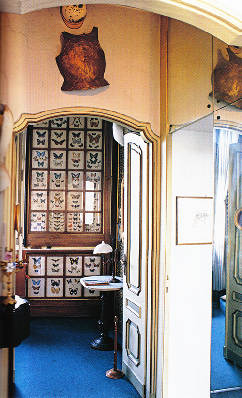
The wall as you walk into the second bedroom is covered with Mollino's butterfly collection. The creatures were cut out of the 1955 book Joyaux Ales, published by Hachette.

Carlo Mollino Casa Mollino Australian Vogue Living Carlo Mollino Casa Mollino Australian Vogue Living

In the dining room is a marble table by Mollino and Tulip chairs by Eero Saarinen for Knoll. One of two Japanese paper lanterns hangs over the table, the other is in the living room. Mollino was fond of grouping items in pairs: 2 Japanese lanterns, 2 Murano glass chandeliers, 2 large Tridacna clam shells, etc. In the left corner of the dining room is an Arteluce lamp by Gianfranco Frattini. A beautiful tortoise shell hangs on the wall above the buffet. The mirror on the wall has corroded over time and is now has a beautiful patina. I love the juxtaposition of all these disparate items Mollino has created. Double velvet curtains hang at the windows and are also used to divide the rooms.

Carlo Mollino Casa Mollino Australian Vogue Living Carlo Mollino Casa Mollino Australian Vogue Living

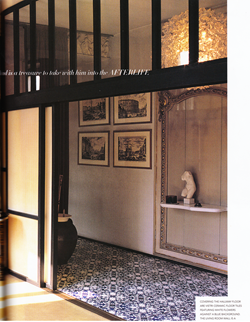
Covering the hallway floor are Vietri ceramic floor tiles featuring white flowers against a blue background. The living room wall is a Japanese style sliding partition of wood and Plexiglas.

Carlo Mollino Casa Mollino Australian Vogue Living

In the lounge room is a photographic enlargement of a 19th century etching, a Louis XVI style fireplace designed by Mollino and an antique gold and ivory plaster mirror frame. A Caori coffee table by Vico Magistretti for Favina is placed in front of 19th century armchairs from Mollino's family home. The Japanese paper lantern echoes the one in the dining room opposite.

Carlo Mollino Casa Mollino Australian Vogue Living

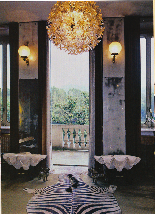
Leading to the balcony (which has a beautiful outlook over the Po river) are a Zebra hide (Joni I though of you when I saw this), 2 Tridacna clams and a Venini chandelier (one of two - the other is echoed in the entry hall). The stripes on the zebra are very indicative of the curves in Mollino's furniture designs. The mirrors on either side of the door have corroded over time and add to the magical allure of the space. Venini is still manufacturing this fixture.Carlo Mollino Casa Mollino Australian Vogue Living

A marble shelf made by Mollino in the hall next to Man Ray's iconic "Tears" photograph.

Carlo Mollino Casa Mollino Australian Vogue Living

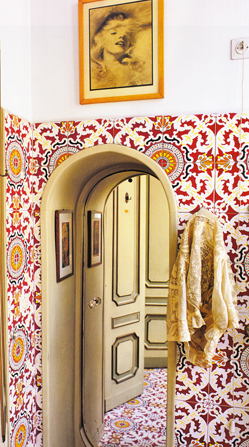
The bathroom featuring Vietri wall tiles and an "Aircraft Door" (how interesting) serves as a link to the bedroom. Over the threshold is a portrait of Marilyn Monroe by Jack Cardiff.

Carlo Mollino Casa Mollino

The Societa Ippica Building built in the late 1930s and destroyed in 1960. It was designed as a riding academy and this was the reception room. I love the totally modern and very curvaceous wall. What a shame it was demolished!!

Carlo Mollino

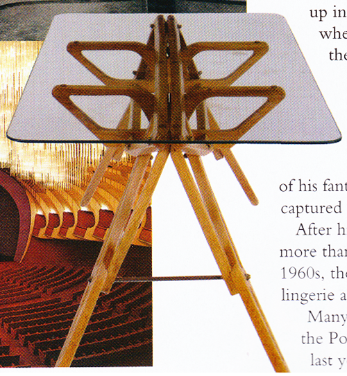
This is Mollino's oak and glass trestle table that sold at Christie's for the world record price of nearly 4.5 Million

Carlo Mollino Carlo Mollino

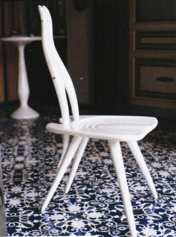
Left: This is a reproduction of an original Mollino design chair by Fulvio & Napoleone Ferrari at Casa Mollino. It's curvaceous design is very anatomically correct as I witnessed when I sat in it. The back resembles the curve of the spine and the seat is wonderfully contoured. Mollino's knowledge of the human body was indispensable for the creation of his revered furniture pieces: chairs, tables and shelves deriving brilliant and functional solutions from anatomical-inspired structures and shapes. I asked Napoleone if they would please bring this chair back into production.

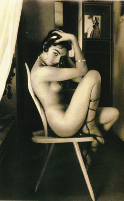
Right: No not a picture of me, unfortunately. I was dressed in full tourist attire and as it was a very hot and humid day (approx 38 C and 67% humidity), I was a dripping puddle - not exactly the picture of seductive allure! This is a Mollino portrait of Evi circa 1950. The chair is a one-off item Mollino designed for his own home. Mollino was an avid photographer and was very fond of the female body.

The Furniture of Carlo Mollino

The Furniture of Carlo Mollino
Napoleone & Fulvio Ferrari have written a wonderful book on the work of Carlo Mollino. It is the culmination of 3 years of research and documentation by them.

I will leave you with this great quote of Carlo Mollino:

"Everything is permissible as long as it is fantastic"

Excerpts from: Australian Vogue Living Mar/April 08
Photography: Johannes Mueller
Text: Paola Moretti

Patricia Gray writes about Interior Design inspirations, emerging trends, and the world of Design. 
While you're here, subscribe to this feed so you don't miss out.
2011 � Patricia Gray | Interior Design Blog�

Related Posts: