Italian Lighting Design

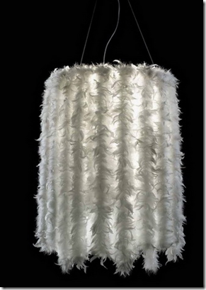
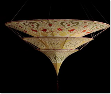
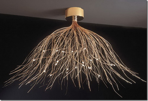
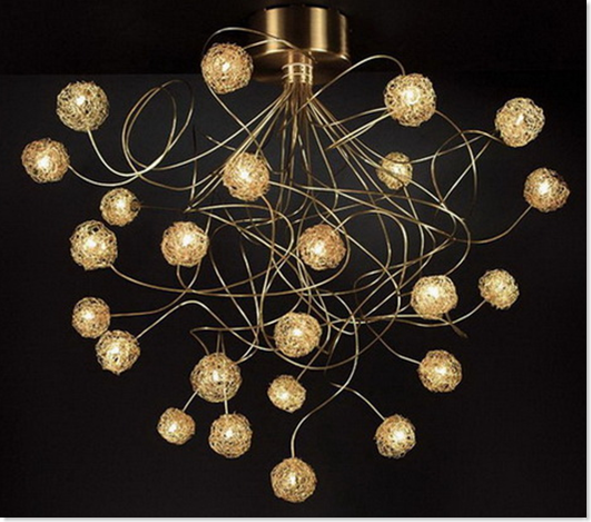
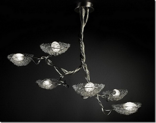
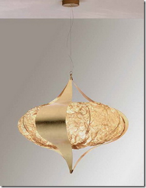
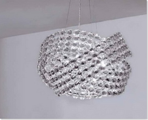
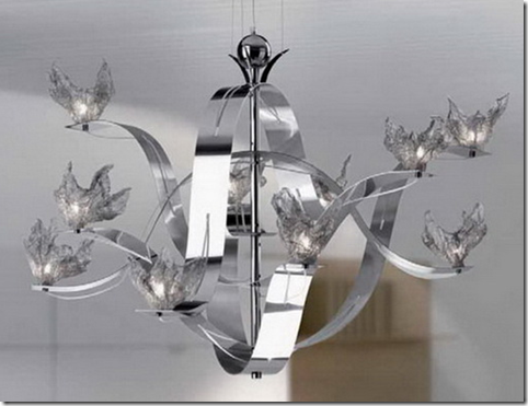
Some Beautiful Italian designed lighting fixtures. I love them all, but especially the first image of the "Feather Chandelier". How fun is that?! I would hang it in a bedroom, closet area, or maybe powder room. The second image is a classic "Fortuny" style design.

image image

image

image

image

image image

image

image

image
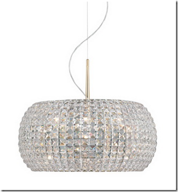
These would be nice over a kitchen island

360 Italian Design

Patricia Gray writes about Interior Design inspirations, emerging trends, and the world of Design.
While you're here, subscribe to this feed so you don't miss out.

Related Posts:

Ferrara Italy - The University of Architecture

image

It's official, I am going to be studying at the renowned University of Architecture in Ferrara Italy for the month of July 2008!!! This University is situated in the Medieval walled city of Ferrara and has been the top ranked University of Architecture in Italy for 8 consecutive years. The University of Ferrara was founded in 1391, and that makes it one of the oldest Universities. I feel very honored and privileged to be studying at this facility under the tutorage of top Italian Professors in the "Facolta di Architettura di Ferrara".
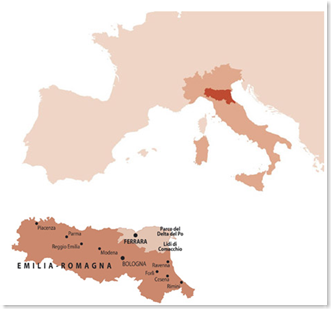
image image

Location of Ferrara in Italy This is a map of Ferrara and you can see the
outlines of the wall around the city.

Ferrara is a city in Emilia-Romagna, northern Italy. It is situated 50 km north-northeast of Bologna, on the Po di Volano, a branch channel of the main stream of the Po River. The town has broad streets and numerous palaces dating from the 14th & 15th century. It is a walled Renaissance city, surrounded by 9 kilometers of ancient red brick walls. For its beauty and cultural importance it has been qualified by UNESCO as World Heritage Site. Ferrara is a "bike city". When I arrive, I am given a bike to ride back and forth between campus and the Residence. It is apparently a 10 minute bike ride. Very European and very energy efficient, as well as good exercise.
ferrara picture italyimage

The city walls and one of the gates into the City of Ferrara Ferrara is a bicycle city--as you can see from
in front of the train station.
photos James Martin


I will be taking two courses juring the month of July:

Univ external picc.JPG
The Faculty of Architecture building

The first course is 19th - 21st Century Design
History of Italian Architecture, Interiors, Furniture & Graphic Design
Taught by Prof.ssa Dr. Giulia CERIANI SEBREGONDI
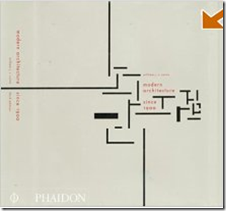
My text books for this course are two "Bibles" of 20th Century Architecture and Furniture Design

imageimage
20th Century Furniture Design Modern Architecture Since 1900 by William Curtis
by Klaus-Jurgen Sembach The front cover is Ludwig Mies van der Rohe
Brick Villa Project, plan, 1923


2. My second course is Sketching and consists of three nodules
Module 01 taught by Prof. Mario MANGANARO
- Proportioning an drawing plans and elevations
- Direct perspective and exercises on representing elementary volumes
- Field exercises
- Examples of travel sketches (Rome, Venice, Naples, Palermo)
- Field Exercises
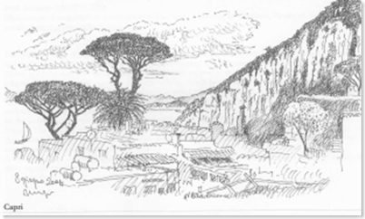
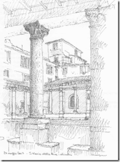
image image

Module 02 taught by Prof. Salvatore SANTUCCIO
- Part One: a theoretical lecture focused on sketching history in recent architecture from the experiences of Le Corbusier in the Middle East and Delacroix in Maroc
- Part Two: "on site" sketching in the city centre of Ferrara. At the end of class students should have a rich sketch book with some different drawings of Ferrara to show on final examination.
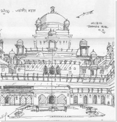
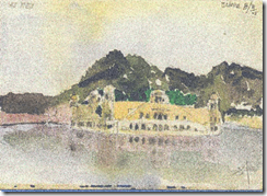
image image

Module 03 taught by prof.ssa Carolina CAPITANIO
-
Tools and methods for a sketching survey to highlight the major elements of an architectural text
Consists of 3 lectures on developing the sketching survey through:
The rules of classic architecture
The rules of modern Architecture
The interiors survey
The building survey
The townscape survey
The landscape survey
image image

As well as having classes on campus we have 3 field trips planned in Florence, Rome, Venice, and Milan.
I can hardly wait as I have never been to Florence, Rome or Milan. And what makes it even more interesting to me is that instead of studying Antiquity, we will be visiting 20th Century Architectural sites. I will have an extra free day in each of these cities so of course I will visit the museums and Historical sites.

Stay tuned and I will fill you in on my adventures in these four Cities

I love this quote by Mark Twain:
Twenty years from now you will be more disappointed by the things you didn't do than by the ones you did do. So throw off the bowlines. Sail away from the safe harbor. Catch the trade winds in your sails. Explore.
Dream. Discover.

Related Posts:

Ottomans, Benches, Foot Stools, Hassocks

Ottomans have become a favourite of mine to use in family/media rooms and dens. I like using them for several reasons. First and foremost they serve as the indispensable coffee table. I like to make mine with tight tops and rather flat as opposed to padded with a pillow effect. This way you can set things on top of them without worrying about them toppling over. Secondly you can comfortably set your feet on them and be in a semi-reclining position to watch TV, read or maybe even fall asleep. Thirdly I can have them made any size to fit the requirements of the room. This is a real benefit because large coffee tables are hard to find and are more costly than having an ottoman custom designed for the space. In the space below the ottoman is made out of deep chocolate brown faux Ostrich. This family has two young daughters and they use the ottoman to color on and do their craft projects and have snacks. Spills can be wiped up easily, and the deep brown faux ostrich adds and a nice textural interest and makes a dramatic center focal point for the room.


Laurel 8408
Patricia Gray Inc. Photo Roger Brooks


Laurel 8393
Patricia Gray Inc. Photo Roger Brooks
These ottomans (in the same house as the photo above) go against my tight top rule, but who couldn't resist sitting down in this den and putting your feet up on a down filled leather pillow top ottoman.


Louie 13

Patricia Gray Inc. Photo Roger Brooks

Gray-Louie 4A LG

This ottoman is large by ottoman standards 5 feet by 3 1/2 feet. It is covered in Holly Hunt, Hair on Hide Leather, in a creamy butterscotch color. It was made long so 3 people sitting on the sofa could all put their feet up on it, and I made it deep enough to that there was still room at the back for the inevitable books, magazines, remote controls and trays for snacks and drinks. It also doubles as extra seating for parties. What coffee table has that much versatility?


pat_gray_homer_1 Patricia Gray Inc. Photo Gary Beale
The Ottoman in this penthouse I had made in charcoal gray Beacon Hill "Pashmina". It is soft and luxurious like a Cashmere blanket and makes a nice warming contrast to the leather sofa. It sits on top of the same color of Belgium wool area carpet. Facing the sofa is the view with the TV hung and framed between the windows. Where else do you put the TV in a room that is all windows & view.


pat_gray_homer_2
Patricia Gray Inc. Photo Gary Beale


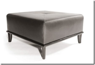
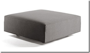
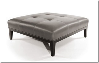
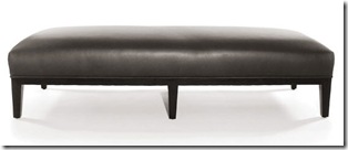
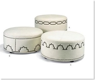
Below are some more designs for ottomans, benches, foot stools, and hassocks that I like.


tufted bench1 tufted bench5


tufted bench3 tufted bench4


tufted bench tufted bench.jpg2


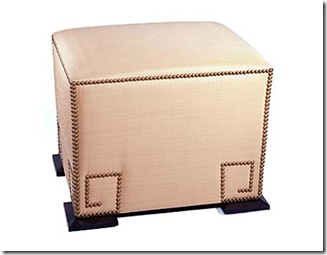
madeline stuart greek key ottoman Tangier hassock michaelbermanlimited  ottomans


Madeline Stuart Greek Key Ottoman Tangier Hassock by Michael Berman

Related Posts:

Illusion Feadship - White Bedroom at Sea

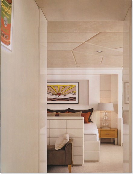
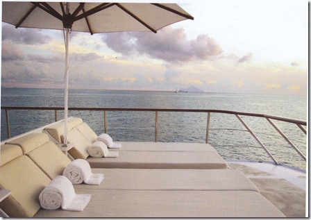
In continuing with my theme of "White Bedroom" postings this week here is another one!! This white bedroom is in a newly refurbished Feadship yacht designed by Frits de Voogt in 1982 named "Illusion" and is featured in this month's Architectural Digest magazine. You can read the full article here. The Interior Design Firm - Bannenberg Designs out of London "covered a wall in white wallpaper, they white-lacquered the cabinets, they upholstered the bed in squares of white leather and they furnished the space with pale oak pieces." What might have been startling is instead restful, in a way that only white can be when it is properly employed. As well as wanting to curl up in this restful bedroom, I would also relish curling up on the Aft deck (shown below) with a good book this weekend!

IMG_0003
Master Stateroom decorated in multiple textures of white

IMG_0002
1983 Feadship "Illusion"

IMG_0001

Aft Deck

Related Posts:

Another White Bedroom

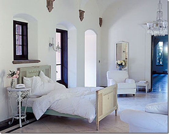
I don't know how I missed including this picture in my last posting on White Bedrooms.

Shabby Chic via Cote de Texas

Shabby Chic via Cote de Texas
Cote de Texas describes this picture as: Gustavian and Shabby Chic - the new combination.
I would love to sleep in this bedroom!!

Patricia Gray writes about Interior Design inspirations, emerging trends, and the world of Design.
While you're here, subscribe to this feed so you don't miss out.

Related Posts:
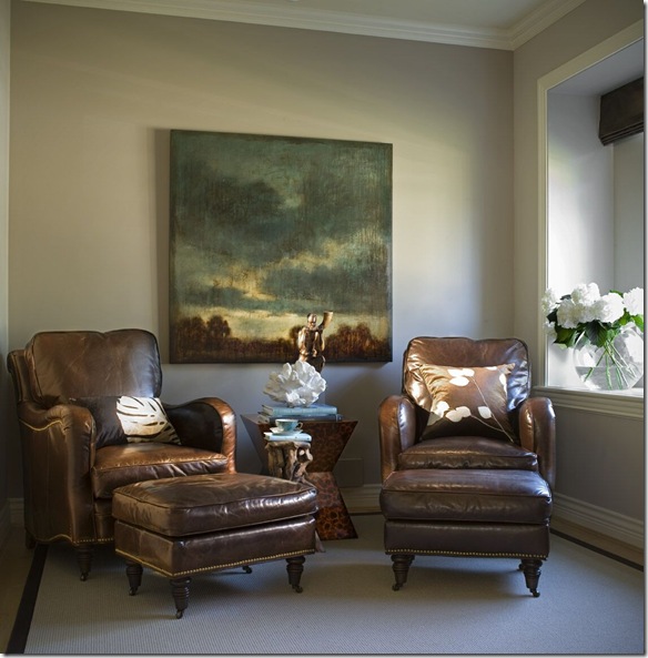
White Bedrooms

Nothing is more timeless, serene and restful than WHITE ON WHITE in a bedroom. I grew with a white bedroom and I can still remember the quality of light that came through my white curtains as the morning sun was rising. When I design an all white room I use several shades of white to bring out the architectural details, or I layer the space with strong forms in different tones and textures of white and then use some strong contrasts to outline and bring the white into focus. Every room no matter what colors are being used can benefit from a touch of black. Some of my favorite whites I use are are from Benjamin Moore: Cloud White, Simply White, Ballet White and Designer White. My all time favorite is Cloud White. I like it because it has a chameleon effect and it is a very soft. Not every white is snow white. Try using: ivory, cream, antique white, and palest beige, blue and yellow.
I like the way that Thomas Pheasant has treated this bedroom architecturally.
The wrap around tufted low headboard creates a unified feeling to a room that has angled walls.


Vicente Wolf is a master at juxtaposition.
His signature element in all of his rooms is a large over sized mirror, usually resting on the floor.


This is Nancy Corzine's very elegant bedroom. Photo via New York Social Diary
The mirrored screen creates a lively play of light and images.

Super Luxe by Alberto Pinto.
I like the layering of the padded headboard on a padded wall.

Fun & whimsy by Antonia Hutt

Hotel Luxe in Marrakech


This is a Master Bedroom that I did for a client, which was in a Heritage building, in
Vancouver's historic Gastown. There are recessed sliding glass doors on each side of the
bedroom to close it off from the dining room on one side and the ensuite bathroom on
the other side.


Mimmi O'Connell  I love the Campaign bed used here and also the textured white carpet.

Thomas O'Brien I like the use of paneled mirrors on the closet doors.


Mary McDonald Who doesn't love a canopy bed.

John Stefanidis


Tom Scheerer

253hicks

David Hicks - the King of 4 Poster Beds

hicks2
David Hicks

alberto Pinto1

Alberto Pinto

ce-whitedittonbed

Elle Decor

Elle Decor

williamssonoma

Williams-Sonoma

Click here to see other posts on Color

Patricia Gray writes about 'WHAT'S HOT 'in the world of Interior Design, new and emerging trends, modern design,
architecture, and travel, as well as how your surroundings can influence the world around you.
© Patricia Gray Interior Design Blog, 2009

Related Posts: